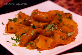
 |
| Um, not my best work... |
As any food blogger can attest, taking pictures of food at a restaurant is rarely ideal. I've already mentioned the problem with lighting. Lighting is actually a multi-faceted issue: First, the kind of artificial lighting used in restaurants is typically horrible for food photos. Sometimes it is because "mood lighting" is simply way too dark. Most of the time, it is because of the yellowish tint that artificial lighting casts on the image. Take a look at this example of a photo (not from Himalayas) I posted recently:
 |
| Yellow tint alert! |
It is not a bad photo by any means. But, the plate on which the fried zucchini is served is white in real life, and it is definitely NOT white in the picture. Basically, dim indoor lighting throws off the "white balance." Sure, there are ways to adjust the white balance either on your camera prior to the shot or using photo editing software during post-processing, but the result isn't perfect and it can sometimes look over-processed. It's a delicate balance that I have frankly yet to master. Granted, I do think there are ways to use artificial lighting well—I have seen examples of it. I'm just not that comfortable with it myself, and to be honest, I don't think it's really my style anyway.
Even if there is sufficient light inside a restaurant (yeah right!) or you are able to pump it up during post-processing, you often end up with uneven lighting and harsh reflections where the light directly hits, like this:
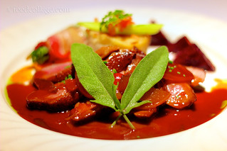 |
| Uneven lighting and harsh reflections |
Notice the top right region of the photo is brighter than the rest of the image, and there are also some really strong reflections bouncing off the meat in the middle and on the lower left. This is the best I was able to do with post-processing, and again, you can see that there is only so much you can correct digitally.
One far-from-ideal remedy for these lighting issues is to use a flash with a diffuser, but flash lighting is still artificial lighting, and the harshness of the light is tricky to adjust. Also, it's a little obnoxious to shoot your food with flash in the middle of a restaurant. For these reasons, I almost never, ever shoot food photos with flash. (I did make an exception once where the restaurant used blue lighting—now that's one clear case where flash lighting is definitely better than having a blue tint over your food!)
Even if you do get to work with natural daylight, you may be mixing the natural lighting with the artificial lighting inside the restaurant. Now that right there is a problem that no software can fix! And even if you only have to contend with a natural source of light, you have the problem with shadows. Here's an example:
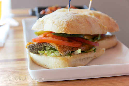 |
| Natural lighting—check! Shadow—check! |
Notice that the light source is coming from the left, so the left side of this sandwich is bright, but the right side is in a shadow. There are ways to adjust this during post-processing as well, but again, there is only so much you can do before your picture starts to look stupid. The best way to remedy the shadow problem is to use a white surface to reflect or bounce off the light onto the shadowed side as you take the photo. I use a white foam board for all my photos taken at home for that purpose, but no way do I want to bring a white foam board to a restaurant!
Taking photos of food at a restaurant also means you can't control things like what's in the background. Often, your table is crowded with other plates and glasses and whatnot. Here's an example of a photo where you can see random plates and harsh shadows of other objects in the background, so the dish doesn't stand out as much. I suppose if I were really good at Photoshop I could digitally remove those extraneous objects, but I am not really good at Photoshop, and even if I were, it still wouldn't solve everything (like the lighting problems that this photo presents as well).
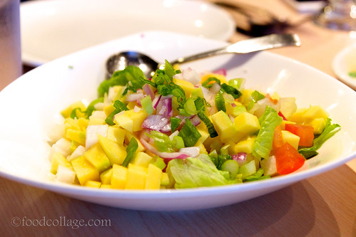 |
| Random unwanted objects in the background |
Anyway, I say all this because returning to Himalayas for the explicit purpose of doing a photo shoot (however informal it was!) meant that for the first time ever I got to be in control of many of these elements I've discussed and truly give myself the best possible chance of getting excellent shots. That was super exciting!
Well, I was in control to an extent, anyway. The setup for the shoot ended up being slightly more complicated than expected because the only window seating at the restaurant faces south—great if you want to be soaked in direct sunlight (and for once we had a warm sunny day!), but not so great for photos! We solved this problem by setting up a small table several feet inside the back door, which we would temporarily prop open any time a dish was brought out to be photographed to let in the perfect amount of indirect natural lighting. Another thing my inexperienced mind didn't consider prior to the shoot was to specify a table without a reflective surface as I struggled a little to avoid getting reflections of the overhanging lamps and other objects in my shots. We did try a tablecloth, but there was a crease showing and the bright red color of the tablecloth really overshadowed the gorgeous food in my opinion. I'm thinking for future reference that either a dark colored tablecloth (black or brown—crease-free, of course!) or a matted table surface might work best (I personally love the look of unfinished wood grain). I suppose a white tablecloth could work, too, but I think dark backgrounds are more my style.
And YES I brought my (small) white foam board because for once it wasn't weird to do so! This means I didn't have to worry as much about shadows and uneven lighting. R. was gracious to help me out as my "light bouncer." In between shots, we ate. We couldn't eat all the food that I photographed, but we did sample four of the main dishes (the Chilli Momo with Chicken, Fried Momo with vegetables, Chicken Vindaloo, and Chicken Tikka Masala—our favorite!) as well as FIVE desserts (the Carrot Pudding, Mango Kulfi, Pistachio Kulfi, Black Forest Cake, and Gulab Jamun—our favorite!). All the food was fantastic. We also got to chat with the staff and the owners, to whom I have given permission to use my photos in whatever way they wish. They expressed an interest in creating a photo menu since many guests are unfamiliar with the dishes, and they also wanted photos of the exterior to help potential customers identify the restaurant as it is tucked inside a small strip mall along Route 19 and not terribly visible from the street. (If you know where the Mad Max or Ichiban is in Cranberry, Himalayas is just 0.2 miles south and across the street, at the Excel Centre.)
For the exterior shots, I had to return first thing this morning so I didn't have to contend with cars in the parking lot blocking my view or having them reflected off the glass doors of the restaurant. It was cloudy when I left my house this morning, but of course it was just my luck that it was pouring down rain by the time I got to Cranberry! I got a couple of shots in, but I may just have to try for better shots in the summer when the trees are greener and the sky brighter earlier (I'd probably have to start at 7:00 a.m. because cars were already pulling into the lot by 8:00 a.m.!).
Working on this project was personally tons of fun for me, and not just because of my tendency to get obsessively excited about food photography. I have said before that the greatest pleasure I've gotten out of this blog is being able to help small local businesses. Doing this photo shoot was very meaningful for that reason and really reignited my motivation to keep this blog going.
Below is a sampling of the photos from the shoot. The entire set can be found here.
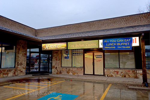 |
| Himalayas exterior shot |
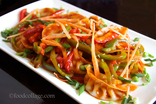 |
| Chilli Momo |
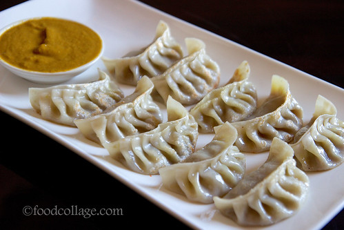 |
| Fried Momo |
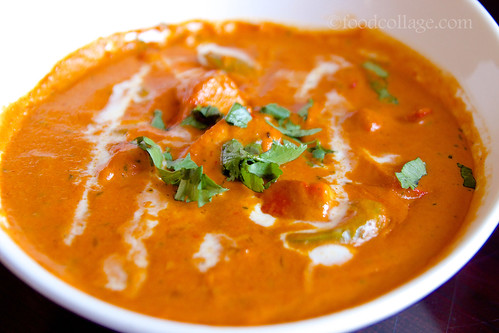 |
| Chicken Tikka Masala |
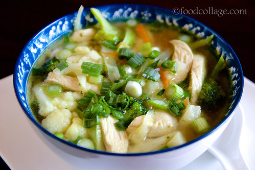 |
| Thukpa |
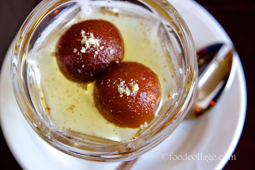 |
| Gulab jamun |
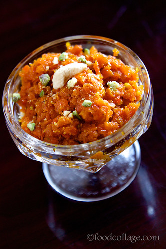 |
| Carrot Pudding |
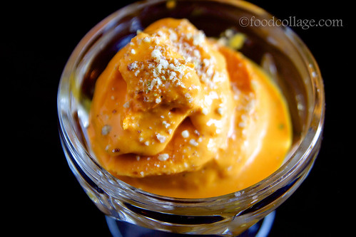 |
| Mango Kulfi |
Restaurant info:
Himalayas Restaurant
20445 Route 19, Cranberry Township, PA 16066
(724) 779-4454
Web | Facebook
View Larger Map

